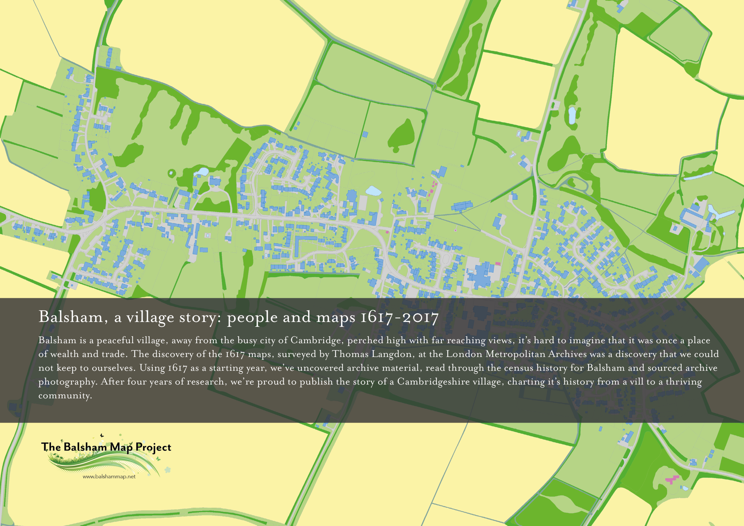

As well as using this website to record the history of the village, we're also using it to record the history of how we made our book. The cover was a particular challenge as you might imagine because of the volume of images.
The problem is often what to put on the cover and what colours and type to use. The maps in the book are incredible but there are 43 to chose from and we lost count of the historic photos of village scenes!
Our designer presented five covers to the team at a cover design meeting last summer and asked us to silent vote. The theory behind silent voting with a shoe box/ballot box (!) means that everyone gets a say without one or two people deciding and leading others by discussion so it's all fair - we did struggle with this as we do like a good natter!
Once we'd narrowed the cover image down, the choice of colour was important. A warm grey with some blue tones is great here because it allows the the back cover images to lift off the page, and the text is clear in white too on the flaps. The flaps by the way, were the best solution we could find for adding strength to the cover so that it didn't get damaged when it was posted or torn on bookcases.
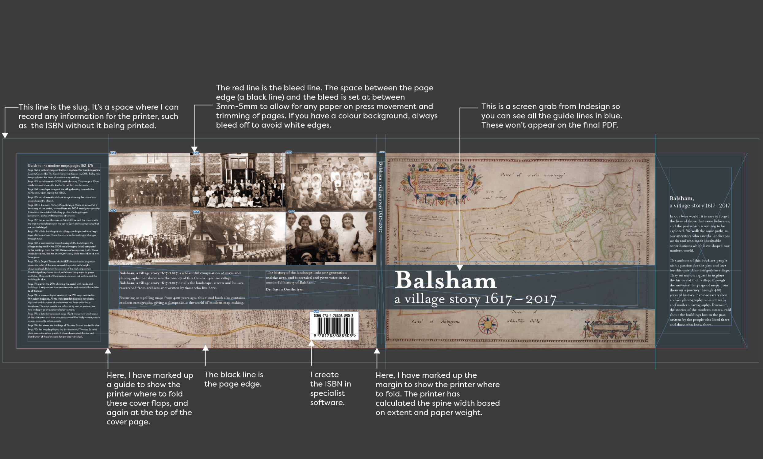
To aid the team, our designer created this illustration below which shows the anatomy of a cover from the designer's side. It shows what each mark means and why they are important to aid the printer and designer to do the best job possible.
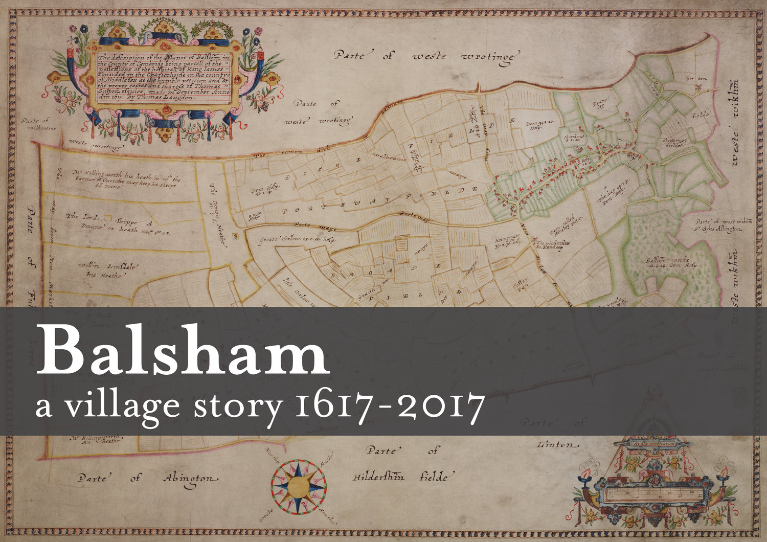
The map we chose is one from Langdon's series from 1616. It required some technical work in Photoshop to make it cover worthy, not least because the beautiful red border on the original map falls close to the trim of the page - literally the bit where the final pages are chopped! Our designer had to create a fake border using the clone tool in Photoshop to accurately copy the vellum texture. The whole cover is created in one Adobe Indesign spread and the width comprises page size x 2, + spine + flap size with a 4mm bleed and 20mm slug space. The typefaces used are Mr Eaves for the sans and Mrs Eaves for the serif.
Below are the covers we didn't chose even though we thought they are lovely. The reason we didn't select some of these maps is because they were not the 1617 map. You'll also notice that the title is much longer and we took the advice of Berenice (designer) and Pauline's (proofreader) to shorten this. What we did love was the images of people on the back cover as it shows that our book covers people and maps. We had to reduce the number of images in order to fit in the back cover text and make sure that you can read it!
Would you have chosen a different cover? What image from the book do you think would make a great cover? Why not let us know at our Talks, Tea and Cake event on May 27th from 2-5pm in Balsham? Join us for a cuppa and quiz the team on how to make a book - Berenice, our award-winning designer and 'book coach' will be there to answer your questions publishing a book. You can find out about maps from Dr. Seppe Cassettari and buy a copy of Balsham, a village story 1617 - 2017. The team would also love to hear memories from current and former residents. All are warmly welcome whether you are a resident or not.